Import this chart into Investor/RT
Click the download button. Then drag and drop the downloaded file into Investor/RT to view the chart.
This chart was uploaded by Investor/RT 14.1.5 showing symbol: @ES#.
Click the download button. Then drag and drop the downloaded file into Investor/RT to view the chart.
This chart was uploaded by Investor/RT 14.1.5 showing symbol: @ES#.
Comments
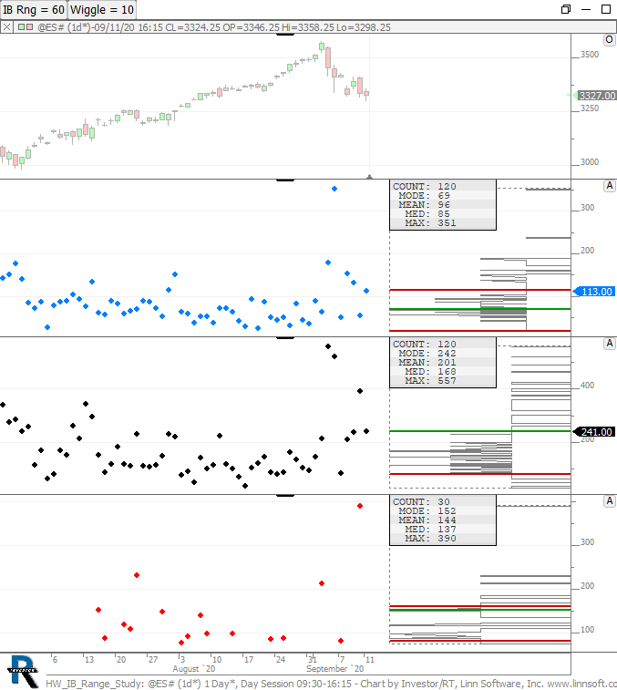
IB Study
The chart above helps predict the ultimate day range based on the range of the IB. The 2nd pane (blue dots) plots the IB of each session with a Profile Indicator on right computing the mode, mean, median, and max. The 3rd pane (black dots) plots the full range of the day session along with the Profile indicator stats. The 3rd pane plots the full day range but filters it based on the IB range, only looking at days that where the IB Range is within the Wiggle of the IB Rng specified with buttons at top. The ranges are specified in ticks or price increments (and not $). For example, if IB Rng is set to 60 and Wiggle of 10, then it will only consider days where the IB Range was >= 50 and <= 70. So on a day where, 60 minutes into the session, the IB Range is 68 ticks, then you might consider setting IB Rng to 68 and Wiggle to 10 to get an expectation of where the days range will end up.